Showing posts with label group project. Show all posts

Monday, 19 September 2016

Animated Assets 001

I'm finally carrying on with the second assignment for Team Sprout which is to build animated assets for our game. I told the team last week that we should aim to have a final style as well as a colour palette for our environment by ...today HA. We've all been quite busy, but now that it's the holidays, we can get a crack on with this assignment.

Today I'll paint up some mushrooms and have a look at colours. We're also going for a water colour look which is going to look really beautiful (it will because Team Sprout have amazing artists). I imagine there to be a white outline around the assets as well as the environment, as if you've cut out the image from a book and it has a border. At least this is what I imagined when Team Sprout were having the meeting. I'll give it a go and see if the team like it :)

On another note, I've been looking at some art from Winnie the Pooh and Peter Rabbit. I had an idea where the start of the game where the forest is burnt down, could be simply black and white and as the game progresses, colour is brought back as life is put back into the environment. This would be a mission to carry out, but it's just an idea for now :)


I like the how the image isn't fully coloured in. There's negative space surrounding the image of the characters Pooh and Piglet which I reckon would be neat to try out for our environment.
I really like the desaturated colours as well.


For Peter Rabbit, I like the fainter outlines as well as the colour being slightly more vibrant in different areas. The elements in the background are faded more than the elements in the foreground which I find very interesting. It helps the viewer focus towards the foreground which would be an advantage to our game. 

References:
http://cartoonsandcereal.breannaperrelli.com/winnie-the-pooh-and-vinni-pukh/
https://lit4334goldenage.wordpress.com/category/books/winnie-the-pooh/
http://www.vam.ac.uk/content/articles/b/beatrix-potter-peter-rabbit/
https://en.wikipedia.org/wiki/The_Tale_of_Peter_Rabbit

Tuesday, 6 September 2016

Animated Assets

Team Sprout
Our new summative is to create 2 environment assets and animate them as sprites. We had a meeting today & Jo is typing the minutes up. We went through assets that would potentially be in our environment as well as animals & bugs. After that we picked what we would chose to draw up & further develop.
Yesterday I already had in mind what I wanted to contribute which are mushrooms & flowers. I drew up a few concepts for each & will ask the group what concept they like the best so I can start developing them into a polished asset.
We each have more than one asset that we will draw concepts of. I will also be drawing up sprouts & other plants. I will look more into native NZ plants also.


References:

Mushrooms
http://www.100thmonkeymushrooms.com/learn/growing-instructions-2/mushroom-box/
http://www.shutterstock.com/pic-400393507/stock-vector-different-kinds-of-mushroom-different-types-of-mushrooms-isolated-on-white-background-edible.html
https://www.dreamstime.com/stock-illustration-different-types-mushrooms-illustration-white-background-image44512924
http://www.gmushrooms.com/motif/
Flowers
http://aljoschathielen.deviantart.com/art/Pink-Flower-371399795
http://zombiedip.deviantart.com/art/Flowers-17824788
http://maw123.deviantart.com/art/Flowers-59649468
http://extraoridnarygirl.deviantart.com/art/flowers-101897724
http://www.deviantart.com/art/Flowers-473654876
https://en.wikipedia.org/wiki/Hibiscus|
https://en.wikipedia.org/wiki/Zantedeschia


Monday, 29 August 2016

Colour Palette

I had a quick look at colours for our game. I really like Ivan Laliashvili choice of colours, so I decided to colour pick from 2 of his paintings. As our game is set in places like forests, the colours would vary. From earthy warm colours to cool colours like water and grass. We are aiming to have a very beautiful game so colour picking is very important. The colours I picked are quite light and not too harsh. The darkness of the colours would vary though in terms of shadows etc. 
ReferencesIvan Laliashvili
http://ivanlaliashvili.deviantart.com/art/Loading-animation-1-399846010
http://ivanlaliashvili.deviantart.com/art/Magic-Kingdom-382158219

Sunday, 28 August 2016

Character Moodboard/ Inspiration

I decided to look up cute little plant type characters to get inspiration for our character. I imagine our character being thin or quite round. Rounder shapes are typically more on the cute side than sharp lines and edges. A character I thought of straight away is bellsprout from Pokemon. It's capable of a lot and it's movements are quite interesting.


References
http://pokemonqrcode.com/bellsprout
http://pokemonqrcode.com/oddish
http://pokemonqrcode.com/bulbasaur
http://zestydoesthings.deviantart.com/art/Marvin-the-Mandrake-320045677
http://safebooru.org/index.php?page=post&s=view&id=1251271
http://c-louds.deviantart.com/art/radish-384453661
http://www.zazzle.co.nz/cute+radish+gifts
http://www.otakustudy.com/video-game/2012/07/nis-america-release-character-profiles-for-legasista/
http://rewatchingpokemon.tumblr.com/post/101634160380/dealing-with-anon-hate-like
http://iliketoothpaste.tumblr.com/post/56358190533

Concepts

Over the last few days, I've been working on character concepts & an environment concept for Team Sprout. I feel like the environment concept that I've done doesn't convey a side scroller look at all. Also this is what the end of a level is most likely to look like. This is due to the level starting off quite dead and as the character progresses, the environment slowly comes back to live. This is due to the character planting seeds and restoring the environment.

For character designs, I started off by using simple shapes and chucking leaves on top (middle & bottom rows) These designs are pre boring.
I then came across this image & thought 'Why don't I add NZ native plants to the characters??'
I drew some Koru & Pohutukawa flowers onto characters. I like these concepts the best! They were fun to draw as well.


Reference
http://probertson.tumblr.com/post/125576347404/succulent-boys
http://www.studynewzealand.eu/archive/1354917493/New-Zealand-Christmas-Tree
http://gonewzealand.about.com/od/NewZealandTravel/tp/Cheap-New-Zealand-Tips-For-Cheap-Travel-In-New-Zealand.htm

Tuesday, 23 August 2016

Group Work! SPROUTS

For the interactive paper, we formed groups to create a game for the remainder of the year. I formed a group with Taylor, Mikayla, Joanne & Tea & we are caller TEAM SPROUTS :D
Yesterday we brainstormed ideas and rather than having separate ideas, we choose the idea of sprouts right off the bat. This is because we found some sprout hair clips and they're pre cute & we wanted to make a cute game. From there we had loads of ideas regarding sprouts and the environment. 
We decided to make the game fully natural, with nothing man made. As the game must have a humanoid main character, our hero will be a humanoid type plant/ sprout kinda guy. We also want our character to be gender-less. Jo wrote down all our ideas and compiled them together. 
Our general idea is that a lil sprout dude needs to replant the forest to save his kind. He will collect seeds and water to help them grow and fight off pests such as snails and slugs. As we had a looooot of ideas, I'm not entirely sure with which idea we're going with just yet, but that's the jist of our game to be :)

After our brainstorm sesh, we each went off to make a moodboard, draw up a few character concepts and environment concepts. The moodboard I've created is more closely linked to the colours and style I imagine the game. The designs in this moodboard are simple,. but very beautiful. We want to make our game purely 2D, so we can focus on the story and making our game very appealing. 2D is also our strong point and we feel like it will be better portrayed in 2D rather than 3D.
I will most likely get the character and environment done in the weekend. I've started an environment in my book, but will most likely take it into paint tool sai to brush it up more :)


Our theme is fantasy, so we are able to change up the environment - with out of this world kind of designs. Ivan Laliashvili shows interesting fantasy environment concepts. The trees almost look like they have natural carvings on the bark. I think it'd be quite neat if we implemented this idea by having natural Maori carvings on the trees to better link it to being a NZ game.


References
http://tyvik.deviantart.com/art/Environment-Concept-349531184
http://domen-art.deviantart.com/art/Flora-and-Scene-Designes-545349113
http://domen-art.deviantart.com/art/Morpho-Goons-Environment-568620774
http://domen-art.deviantart.com/art/Underworld-sidescroller-concept-art-495617010
http://domen-art.deviantart.com/art/Concept-art-for-2D-sidescroller-495616936
http://pyroxene.deviantart.com/art/Sagramore-MMO-background-gfx-1-256612930|
http://fgfactory.deviantart.com/art/Environments-627483972
http://jurgitaart.deviantart.com/art/2D-environment-520575262

Ivan Laliashvili
http://ivanlaliashvili.deviantart.com/art/Loading-animation-1-399846010
http://ivanlaliashvili.deviantart.com/art/Magic-Kingdom-382158219

Sunday, 19 June 2016

Giving Feedback

Because I suck at working after effects xD Taylor had me look over the shots she's been working on to give feedback. I'm better with giving feedback to be honest ...Any who, here's a typed out version of what I wrote down for her.

Shot 2 -Lighting on Hamish is very bright once he's about halfway across the screen. The lighting needs to be dulled down. If the light was to be strong on Hamish then I feel like a shadow should be cast on the couch as he walks past.


Shot 3 - More orange -would contrast better with the blue. Perhaps face in of mirror world a bit later also. Hold the image of the real worlds door so the audience can take it in. Hold for about 1 and a half seconds.

Shot 5 - Lessen glow on Hamish (it's a tad too strong).


Shot 6 - Skin colour too light? Her lips shift over towards the end of the animation. Newspaper may need a blue tint (a little bit - bounce light of blue coloured environment). Again, the mirror world needs to be more orange.

Shot 7 - Lessen glow on Hamish as well as in the mirror world.


Shot 8 - Lighting on Hamish is really nice! Lessen glow just a tad.

Thursday, 16 June 2016

Shot 9.1

Today, I worked on shot 9.1 where the actor drops his head down and Elizabeth looks sympathetic towards him.
There was a list of things to change that Taylor wrote up being:
-Background images of both the real world and mirror world to be updated.
-Update the animation of Elizabeth (As clean up is finished for this shot).
-Framing
-Add newspaper (plus overlays etc)
-Adjust bottom right corner of glow to mirror

I have completed all of these things, but will continue to play around with the newspaper overlays and colour. Taylor has been helping me as I'm pre bad on after effects. The glow on the actor is rather subtle, but even too clearly see it - don't want it to be too bright. The mirror might be a bit too white in terms of lighting. We are originally going for an orange kind of light emitting from the mirror. I'm not too sure on how to do this, but I'll give it my best.
The window light still needs to be played around with, it's way too dark. This would be done in Maya.


Wednesday, 15 June 2016

On to Compositing

I'm done with animating and will be moving on to helping Patrick and Taylor with the compositing. At the moment Taylor is sorting out the shots as EVERYTHING was compiled into one file which was around 80gbs :O She has written notes for each shot on what needs to be done to them. Once she's sorted out and compressed shot footage, she will hand me some shots to tidy up :) I'm not that great on after effects, but I will try my best!!!!

Clean Up

I finished the shot I was cleaning on Tuesday (internet wasn't working that day, so I'm posting this now). I've not very happy with it as there are lots of minor things that could be done. But as they are minor, I'm not going to fuss over them too much. I'll hand the shot over to Joseph and hopefully he can tweak it a bit - mainly the left hand.
I really should've noticed these things earlier...
- The elbows went from pointy to curved and back to pointy.
- The left hand and pointer finger are inconsistent in terms of shape as well as movement.
- Her eyes shift a bit, but isn't toooo noticeable. I did adjust the last few frames as the eyes were sliding down the face a bit.
- The eye lid crease moves a bit oddly as the lengths are all a tiny bit different.

Friday, 10 June 2016

Quick Update

I haven't been able to make many blog posts since the last post. The internet keeps disconnecting at home and work was getting in the way a bit. On Tuesday, I started cleaning up a shot (inbetweening) Taylor had cleaned up the keys as well as filled out the rough inbetweens. It was easy to clean up as her roughs were pretty clean. I didn't realize how slow I am at clean up though -.- It's been a while since I last did a 2D animation. I have one more frame to clean up as well as a few faces to fill in as I'm very particular with faces for clean up. .I'll definitely have this done by the end of Monday then I'll hand it over to Joseph, Gabby or Raven to colour. Taylor and I are going to finish animating and move on to helping Patrick compositing for the final!! For people that are carrying on with clean up, I'll give them a hand if they need help and also check on them to see how they're going :)

Today at the meeting, I suggested that we make the newspaper a tiny bit transparent, or something along those lines as there's absolutely no light coming through it. Paper is generally see through (depends on the paper), and with the light coming through the mirror world, we'd need to see some coming through the newspaper. It'd also make it look a bit glowy as it falls from the vanity unit (with the light coming through the newspaper from the light within the vanity unit.

Thursday, 2 June 2016

June 3rd Feedback

Group Feedback
- Show shaking when the earthquake occurs
-Silhouette of Elizabeth needs to be more clear
- Lights flickering/ things falling off the piano
- Slight zoom on the vanity unit when the earthquake occurs
- Show what he's sitting on. Establishing shot of vanity unit with chair in the shot.
- Depth of field for background - not in complete focus
- Tie the light in the mirror more into the real world (Shine on actor slightly)
- Need newspaper clipping and photo on the mirror
- Adjust position of actor in side on shoot -too low
- Put animation in animatic - adjust positioning correctly for shots with white background in animation just change to multiply so piano is visible.

I'm hoping we can still add the image of the sunset/sunrise. This will add depth to the story and the relationship

For the title, Taylor and I reckon it should just be simple text. We want the viewer to know what the title is straight away. perhaps we could just have simple text of 'AFTERSHOCK' on the screen. The door slams shut and the text shakes (like in an earthquake) Also rather than the title fading away, it could dissolve/ crumble away (Like rubble in an earthquake).

Wednesday, 1 June 2016

Animating Update!

On Monday, I forgot my usb and left it at home. I couldn't work on two shots that I had started, so instead I've been inbetweening a shot that Taylor has done. I don't have flash/ animate at home, so i could'nt do any work yesterday at home. Although saying this doing the inbetweens didn't take long. i finished the inbetweens today and started working on the flow of the shirt for that shot. I passed it on to Taylor so she can work on the shirt looking flowy.
Today I started on shot 9 which is Elizabeth showing sympathy towards her husband when he lowers his head. I've got the movement and facial expressions down. I may need to add more inbetweens though :)

Thursday, 26 May 2016

NOPE

Ok, so I'm listening to a sad song from an anime called Angel Beats (don't watch it you will cry rivers). One of the characters are in a wheel chair and I had  A HORRIBLE BUT GRAND THOUGHT THAT IS TOO LATE.
Instead of Elizabeth sitting at a piano chair..she'd sit in a wheelchair D;

https://www.youtube.com/watch?v=tm7Xf9818FM&index=4&list=RDzIFV8UUs1-c


https://gargarstegosaurus.wordpress.com/2010/06/15/thoughts-on-angel-beats-1-11/


Wednesday, 25 May 2016

Two ideas

I've been quite caught up this week with the formative game pitch presentations, but I did manage to start animating a shot on Monday.

The shot is of Elizabeth playing piano and turning towards her husband smiling and turning back to the piano.
I tried 2 different actions for this shot and showed my team mates. They liked the more exaggerated version, but our tutor recommended the more subtle movement as it suits the character better. I understood that, but wanted to show the character being more excited or happy to see her husband.

These are the ending shots for both versions that I tried. First one being the more exciting reaction and the second image being more subtle. I like the first one a lot, but I know that the second image suits the character and the feeling we want to show for the scene - being sad.
I will continue with the subtle version as it suits better :)


Saturday, 21 May 2016

Animatic Feedback

Joseph updated the animatic this weekend. He put some background rendered shots of our environment to better tie in the scene as well as new footage. It's looking really good!
But there are a few picky things that I've pointed out. Sometimes it takes me a while to notice these things - I really should've looked at the animatic more as he's been working on it. I've been talking to him on FB about it and I'll share my points through this blog post.

Just small things include the audio 'No, not again!' wasn't synced to the video. Also adding the music in would be a good idea, as we now have our music. It wont need to be matched up perfectly, but as I said, we have the music. Might as well chuck it in.
Also playing with the lighting on the actor would be good, as it doesn't match up with the environment.

For the newspaper falling down, I recommended having like 2 shots of the newspaper falling (which can easily be done in photoshop) just to show the viewer that the newspaper is actually falling. Because at the moment it isn't showing that it's falling down or really even moved.

Regarding the shots, there are two shots that aren't quite right to me.
-In shot 2, the actor is running his fingers through his hair and this action doesn't seem in character to me. I mean if I was depressed about losing my partner, I couldn't care less about my hair.

-And shot 4, he's looking at the paper in his hands the whole time, not paying any attention to Elizabeth. Like why would he pay more attention to the paper than his deceased wife? He's pretty lucky to be able to see her when she's not physically there. Priorities man. So I suggested having him 'look at Elizabeth' until he sits down then he can glance at the papers then back to his wife. I mean putting myself in his shoes, I wouldn't pay any attention to work, food... anything! I'd focus on the wife. He was her world, it makes sense.

Reshooting these would be a good idea :)

(BTW Hamish, your doing a great job! I'm just nit picking),

Thursday, 19 May 2016

Rough Animating

FINALLY, we've started rough animating. I started shot 6 where Elizabeth is playing the piano and she turns to her husband and turns back to the piano. It's really rough and is only construction. It looks... not nice, BUT our main focus at the moment is to get the movement across then go back to the hair and clothes. I'm not too sure about the second key/image, maybe it's because there's no face as it looks a bit creepy. The tilt might be a bit too much.
There are only 2 keys so far for this shot, but I don't think we really need anymore..


Wednesday, 18 May 2016

Animation Planning

Taylor and I went over the animation plans. We only have 6 shots of animation which isn't much at all. We don't even have much action, but we will focus on the main movement of Elizabeth first, then go over the hair and clothes after. Some shots don't have much action, so we have made a system where we show the easy, medium and a bit more difficult shots to animate. This way the people in our team can say what shots they're most comfortable animating.
At the moment Taylor is drawing up some frames of Elizabeth's construction to work off as guide being side on and 3/4. This way the rough animators in our group wont go astray where she'd keep moving slightly around the screen. (Hopefully this DOES help!!)


Music

Unfortunately Holly cannot compose a score for us, as she is a very busy. BUT this is ok as we have found an alternative. Only Joseph and Gabby have heard it and they really like it. The others need to listen to it soon.

I like the constant flow of the first minute where there are no up or down parts to it. Although between around 1.25-2.30 there are some nice changes to the flow. These will work well with the 'up' parts of the scene (I hope this makes sense, I'm sure there's a word what I'm trying to explain...)

https://www.youtube.com/watch?v=0YRICEt7XiY

Thursday, 12 May 2016

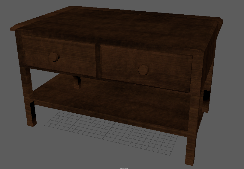
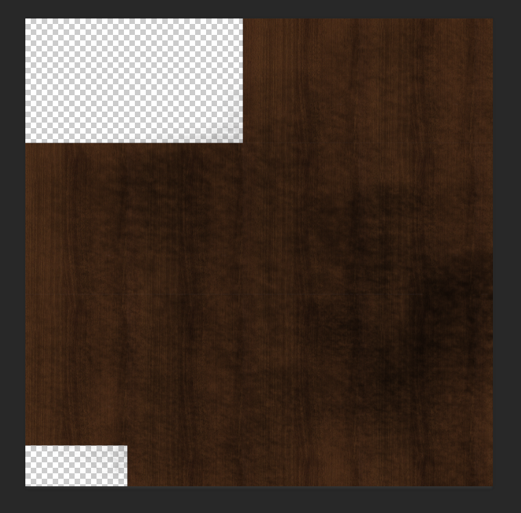
Coffee Table Re-Texture

My tutor suggested making the coffee table more grungy as the other furniture items are quite run down. I went over the textures in photoshop to make a more grunge like and it does look a lot better in terms of the rest of the furniture.