Showing posts with label assignment 2. Show all posts

Thursday, 12 May 2016

Coffee Table Re-Texture

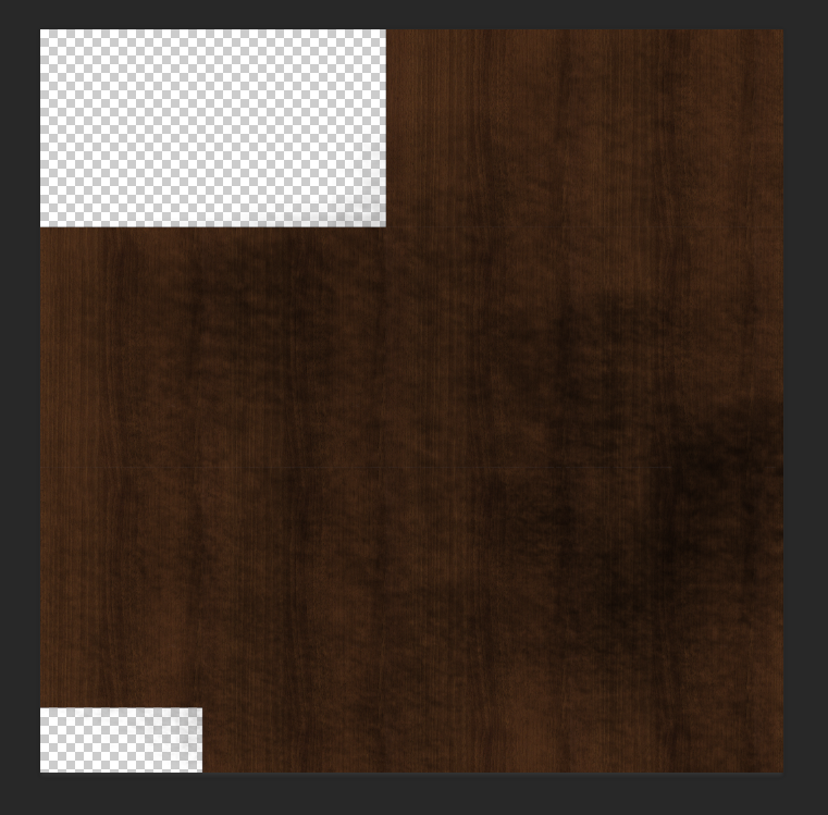
My tutor suggested making the coffee table more grungy as the other furniture items are quite run down. I went over the textures in photoshop to make a more grunge like and it does look a lot better in terms of the rest of the furniture.


Prep for Animating

TAYLOR AND PHOENIX ANIMATION NOTES

SO we need to plan out our rough animation for our scene...

Elizabeth is pre much playing the piano as the husband is talking to her. Her arms are gently moving as she plays the piano
She turns her head slightly towards him and nods and smiles gently while still playing the piano. She turns her head back, concentrating on playing the piano while listening to her husband. Once the rumbling begins, she stops playing and turns towards him with a look of realization. She puts her left hand out to stop the husband while her right arm is resting on her lap. Puts both hands up to her heart and has a loving and reassuring smile. She puts her left hand out again towards her husband.

Her hair would move slowly as if under water. (Not at a consistent timed movement. We can afford to leave some inbetweens out as it would give as an almost random movement to the hair).
Very flowy and gentle. Any loose clothing would also move slightly. Obviously blinking from time to time.


References:
http://rebloggy.com/post/disney-submission-the-little-mermaid-ariel-disney-gif-reaction-gif-ariel-gif-the/78322512164
http://www.fanpop.com/clubs/the-little-mermaid/images/35279051/title/ariel-gifs-fanart

Wednesday, 11 May 2016

Title & Credits Ideas

So like our group totally forgot about the title sequence and end credits D: Our producer, Joseph said that he'd do that credits and I had a pre neat idea.
We can have a shot of the vanity unit to the left of the screen with the credits rolling up the wall next to the mirror. Our actor Hamish would be walking around the room (reflected in the mirror) , but it would be blurred as we don't want the focus on the contents of the mirror but on the credits. It would be quite boring if the credits were rolling on a still frame. Having the lighting change slightly throughout the credits rolling would be quite nice too. For example going from blue light to a pale orange. Even the credits slowly changing colour from blue to orange (might be a bit weird though as credits are generally one colour).

Our tutor suggested having the credits show up in a newspaper article which would be quite nice too. Rather than rolling they can flash (obviously softly).

BTW we have a gnarly as title for our story. Patrick came up with it. our story is called 'AFTERSHOCK' I really like this name as it refers to the aftershock of the earthquake, what and who it has effected as well as the aftershock of the male characters life - being without his wife.

Regarding the title card, we have a few ideas. I tend to find it quite neat when text is embedded into the scene rather than floating on the screen. One idea was to have the word AFTERSHOCK be carved into the corner of the vanity unit table. A truck would drive past causing the vanity unit to slightly shake, showing 'aftershock' physically.
Another idea that Patrick and I collaborated on is the word AFTERSHOCK to show in the shadows on the floor and it will disappear when the door is closed when the husband arrives. With this idea the door could slam shut causing the apartment to shake slightly and the word AFTERSHOCK will be shaken also and disappear slowly after. I'm not sure if the title for this idea would be shown as darker than the shadow or lighter as a sort of light source. I will try both ideas anyway.
Taylor suggested having a newspaper article having the title of AFTERSHOCK also which would be nice in comparison to the newspaper clipping in the scene.

IDEA FOR ENDING CREDITS (come back to near end ish of term)
In terms of a light source during the rolling credits, having a soft candle light flickering on the wall would be super nice.
In the mirror we would show our actor (blurry) walk out of screen and we would hear him light a match. Then a soft candle light would come on, flickering on the wall as the credits roll.
Obviously the light from the match would also shine on the wall, so it could shine on the wall when the title AFTERSHOCK appears as it would be a brighter and a harsher light. Then when the candle is lit, the credits continue.

Bookshelf Changed to blue books

My tutor suggested to change the books to one shade as it was too colourful beforehand. So I changed the books to a range of blues and purples. I reckon it looks a lot better and not super busy. It will also suit the mood and main colour theme, being blue, of the apartment and emotion for the story.


Sunday, 8 May 2016

Vanity Unit Props

I put simple lamberts on the vanity unit objects as they aren't as important as the vanity unit itself. They aren't important props, but they add detail and depth to the scene.
I'm not sure what to do with the magazine stack yet...pretty tempted to chuck a G Dragon magazine cover photo just for Keat HAHA but yeah, might not be suitable, we'll see.

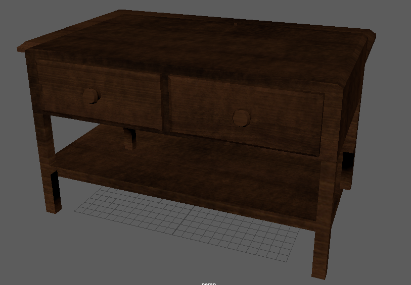
Coffee Table textured

Coffee Table texturing complete! Yay!
I used the same texture as the shelves in the bookshelf, but I darkened the colour by recommendation by Taylor. It turned out really nice and was easy to texture :)


Wednesday, 4 May 2016

Image Planes done

Quickly put together the framed sunset and images of the polaroid photo and newspaper clipping into maya. Tomorrow morning before the meeting, we're hoping to have the scene set up (even if it's not complete) just so we as the group as well as the tutors can see how it will look close to finished. Patrick will be putting everything together in the scene, while Taylor and I carry on working with the objects in the scene. The bookshelf and vanity unit are almost complete. I will start texturing the coffee table once that is ready which will hopefully be done tomorrow.

I took the photo at Muriwai beach in the holidays and showed the group and got thumbs up all round. The sizing of each image isn't quite right, but that will be sorted out later on :)


Textured Bookshelf

Here's a rendered picture of the textured bookshelf. I'll hand it over to Taylor and she will be doing the glass texture.
I haven't had time to work on it at home, but I got faster applying the textures as I worked on it today, so other objects shouldn't take too long. We're really only applying textures on a few things being the bookshelf, coffee table and the couch. Everything else will have a simple lambert on it.

I don't really know why I used complimentary colours on the books that are on the floor. PERHAPS it represents the husband and wife and how they're in opposite worlds~ or because skittles.

Sunday, 1 May 2016

Term 2

I haven't posted anything in the last 2 weeks because..I didn't really do anything. I tried texturing at one point, but I couldn't figure out why the texture was coming up so blurry in photoshop, so I decided to wait until course started back up.

I've started texturing the bookshelf and it's looking pretty good. The texture does stretch a bit at the detailed parts, but we wont be seeing this in the final output of the scene.

Would be ideal to have everything textured and the room set up by next week!!


Thursday, 14 April 2016

Late Ideas

I feel like it's a bit late for more ideas, but I'll post this anyway in case it's some how used.
The bus I catch in to town for course is pretty early, like the sun is rising and I thought of the colours in comparison to the colours we'll be using in our scene.
The husband - blue = cold
The wife - orange/yellow = warm
With the sunrise, the sun meets the sky. We can think of Elizabeth being like the sun. She is the warmth in the husbands world, as if he's the sky.

BUILDING ON THISSSS
Then we bring the sun and moon into the picture.
Taylor suggested a painting of a sunrise in the scene.
I can take a photo of a sunrise and put it into photoshop to fit in with the scene.
There are 2 sources of orange light coming into the apartment being the streetlight outside and the orange aura light coming from the mirror. The shot where Elizabeth fades away, the orange light form the mirror world would fade also, leaving only the streetlight light the only source of orange light.
As Elizabeth is fading, the shot can change to focusing on the sunrise photo. The orange light from the mirror will be on the photo and the orange light will fade on the  photo, becoming more blue.

ALSO as Elizabeth fades, the streetlight can flicker and go out. This will bring the moonlight into the apartment, so the apartment will mainly, if not entirely be blue. Then the sunrise photo could be seen as a sunset.
The moon would represent the husband and the moonlight would shine in as if saying that it is ok to be alone.
The moonlight can shine on the husbands face when he is looking at the polaroid photo on the mirror. This lighting will be a lot more soothing than the streetlight.

Just to get one thing straight, he isn't really the moon, and she isn't really the sun, if this was the case then they'd never be together. 

References
http://e2ua.com/group/moon-wallpapers/
https://springwolf.net/2014/06/09/the-legend-of-the-sun-and-the-moon/
http://7-themes.com/6982647-sunset-over-sea.html

Sunday, 10 April 2016

Earthquake Newspaper Clipping Development

We don't want a perfect looking newspaper article, so I tried out the lasso tool on photoshop to make it look teared around the edges. It looked...bad. Jerwin had a really cool idea and suggested printing it out and tearing it and scrunching it up. So Keat printed it out and I ripped it and stuff. It looks obviously a lot more natural and a lot better :) We will put it on a 3D plane in Maya.


Saturday, 9 April 2016

Polaroid Text

I tried out different brushes for the hand written part on the polaroid photo. My handing isn't pretty, so I hope the group like at least one of these...

I don't like the first image, but I'll put it toward the group any way. The colour is too saturated as well and doesn't fit with the image as a whole.
The second image text is too faint. We want the audience to see the text obviously, so simply making the text darker or thicker will be the way to go.
I like the third image as the text fits well, it's bold easily readable (I hope!)
If the group don't like any, I can always do more.


Thursday, 7 April 2016

Earthquake Newspaper Clipping

When I took art design in high school, we had to make magazine articles. We were told to pick whatever text from the internet and just chuck it in. Earthquakes are natural disasters that have taken many lives and can be a very sensitive topic to people that have experienced earthquakes or lost loved ones from an earthquake. Copying text from an existing earthquake article I think will be too insensitive, so I will try type something out that seems believable, but hopefully wont offend anyone.

I looked up 'destroyed buildings' for an image to use in the newspaper clipping. Lots of bombing incidents and earthquake related photos came up, but I feel like that would be to easy and thoughtless, again: insensitive. So instead I am looking up 'demolition of buildings' this way no one was really hurt and the destruction was man made and intentional.
The image below is from a demolition in Chicago that needed to modernize the hospital complex at Rush University. I reckon it works well :)

http://chicagoist.com/2016/03/01/since_2004_rush_university_has.php#photo-1


I need to make it look a bit old and the edges will be a bit torn. Might try a sepia type overlay to show that it has aged a bit. I tried to write it sort of realistically. This isn't the final newspaper clipping. As I said, I will add overlays and play around with the effects to get an old slightly ruined look.

Polaroid Photo

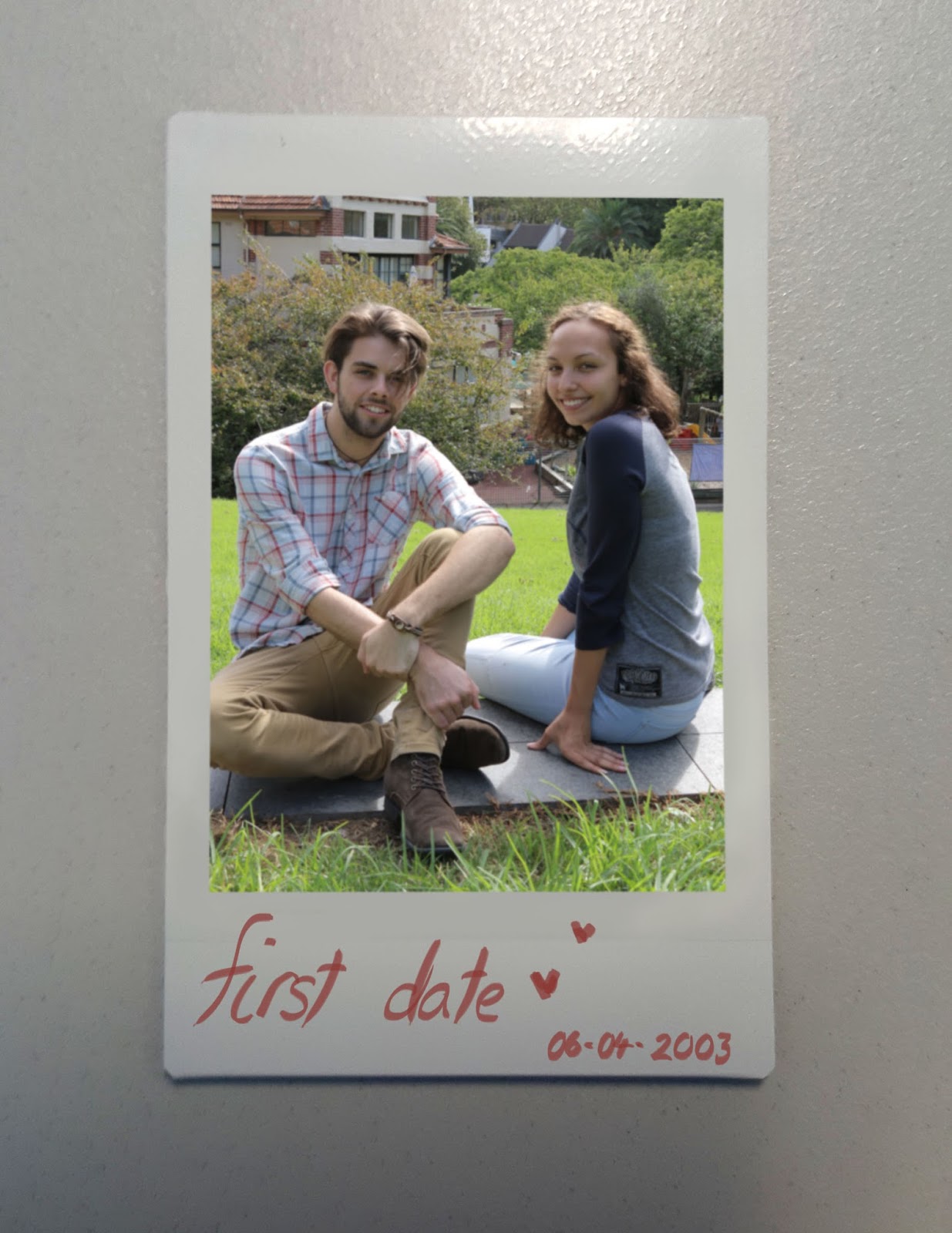
We picked the final photo to use for the polaroid photo of our actor Hamish/ Husband and Holly/ Elizabeth/Wife. Here they look very happy which was the goal.
I've started to photoshop the photo onto a polaroid photo. I don't want to pick a font on photoshop as it will look way too fake (even though it is). Later on I will write 'First Date' as well as a date on it with my tablet so it is hand written and more natural and realistic. I put a gaussian blur over the photo itself as it was too sharp for a polaroid and it needed to fit in more.


Wednesday, 6 April 2016

Research and Textures

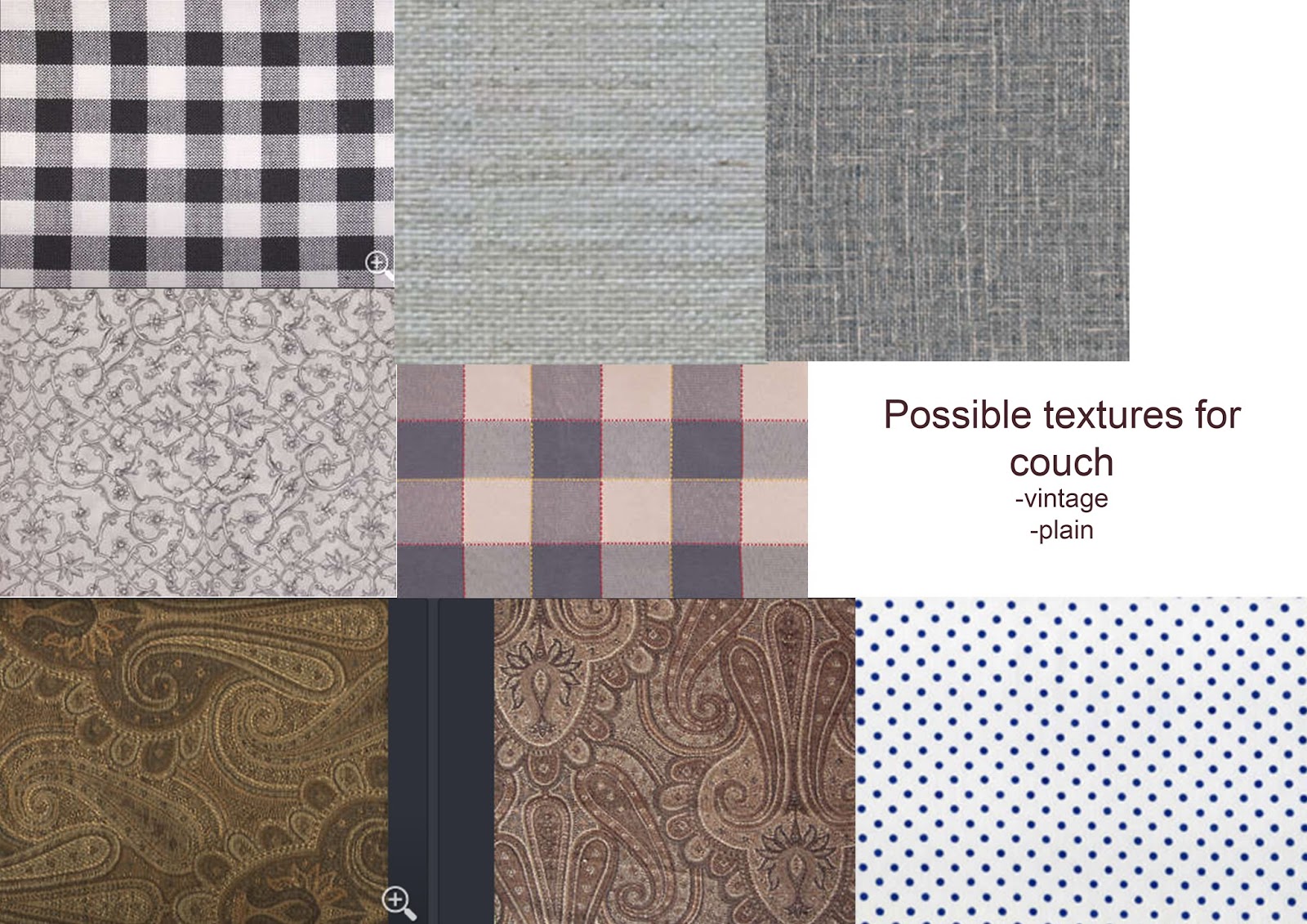
Taylor and I reckon that it's best to go for a fabric couch rather than leather. Fabric has a more homely vibe and goes well with the rest of the furniture. Greys and blues are probably the best way to go, but the lighting will have this effect on the couch anyway due to the lighting being rather cold plus lots of the furniture will be in the dark (should be a blue tone).
I had a look at patterned fabric and plain fabric for the couch. There's not much similarities with the fabrics I chose, but I will show the group and we will come to a final decision. This also goes for the other textures. Plus I'm not necessarily choosing fabrics that I like, as a few of them a pre ugly),

I originally had dark wood in mind for the bookshelf, but after doing some research I reckon that any wood would be fine. It will most likely turn out dark anyway as the light source isn't on the bookshelf and the room will be dimly lit.This goes the same for the coffee table.


References for research
Couches
https://www.youtube.com/watch?v=hYulK7l6R3o
http://www.sunderlandbins.co.uk/sofa-recycling-sunderland/
http://liveitloveitblogit.com/2012/06/the-craigslist-decorator-couch-edition/
http://www.sunnysimplelife.com/2012/09/how-to-refill-couch-cushions.html
http://tampabaycor.com/couches.html/old-couches-in-couches

BookShelves
http://www.homedit.com/ladder-style-bookcase/
http://theinspiredroom.net/2012/03/28/lighten-up-a-dark-bookcase-without-paint-home-office-makeover/
http://likesuccess.com/topics/9585/bookshelves
http://sandiegorustic.com/solid-wood-bookcases/
https://nz.pinterest.com/laird6800/rustic-furniture/
http://www.ncrustic.com/rustic-office-furniture-rustic-bookshelves/
http://foter.com/explore/pine-bookcases

Coffee Tables
http://ottomancoffeetable.dreview.net/coffee-tables-for-sale.html/coffee-tables-for-sale-sydney
http://www.dollwizard.com/favorite-37-nice-pictures-cherry-wood-coffee-tables/
http://www.dollwizard.com/best-14-most-popular-coffee-tables/
http://even.sharovnya.com/rustic-wood-coffee-table/antique-rustic-wood-coffee-table/
http://www.ana-white.com/content/tryde-coffee-table
http://furnituretexture.club/wooden-coffee-table/

References from http://www.textures.com/
Couch Textures
http://www.textures.com/download/fabricpatterns0116/107668
http://www.textures.com/download/fabricpatterns0008/8778
http://www.textures.com/download/fabricpatterns0003/8773
http://www.textures.com/download/fabricpatterns0039/9685
http://www.textures.com/download/fabricplain0044/8769
http://www.textures.com/download/fabricplain0077/20271
http://www.textures.com/download/fabricpatterns0089/24998

Bookshelf/ Coffee Tables Textures
http://www.textures.com/download/woodfine0024/19801
http://www.textures.com/download/woodfine0072/116098
http://www.textures.com/download/woodfine0021/19798
http://www.textures.com/download/woodfine0025/19802
http://www.textures.com/download/woodfine0073/116102
http://www.textures.com/download/woodfine0043/40537
Monday, 4 April 2016

Tasks to do

LOL scratch that last post. I have found things to do! Thanks to Taylor, i told her that I'm stuck and she suggested that I ask Patrick if he can take on texturing and UVing. I emailed him asking if it's cool, so hopefully it is. In the mean time, I'll look at materials and textures we can use. I'll try get this done by Thursday, so the group can finalize what textures they like for different pieces of furniture,

Taylor and I also had an idea regarding the photo attached to the mirror. I thought instead of it being any old photo format, it could be a polaroid. On polaroid photos people tend to write the date, time and/or place it was taken. Taylor then suggested that we can write on it 'FIRST DATE' with a heart. THEEEEEN I thought we can show the dates on the polaroid photo as well as the newspaper clipping. This will show how long they've been together and will be a rough timeline. It will be more obvious to the audience also which is to our advantage.
Once we have finalized an image to use of Hamish and Holly, I will photoshop it on a polaroid and this can contribute to one of our final images.

I really feel like everything should be looked into. It'll create more depth in the story as it already is quite a deep story and quite meaningful. The photo is what pulls the husband out of his depression, so it should be shown with a lot of thought put into it.

Thursday, 31 March 2016

Set Up Coloured

Here's the coloured version of the set up. With the ideas concerning lighting and colour that I had,.. I felt like it wasn't quite getting across to my group, so I thought a visual would help. It was different in my head which is unfortunate. Taylor helped me with the lighting and shadows as I'm just no good at painting on photoshop. So the light from a street lamp will be shining in through the holes in the sheet covering the window and will shine on the husband.
Dane did suggest making the room cramped and smaller. I did take this into consideration, but this is just a concept revolving around lighting, not so much the space.


Wednesday, 30 March 2016

World Colours

Ok, so I had to tie in kpop some how >:D kidding! there's a legit reason. So BTS released a mini album last year and they have two different colours: blue/ grey & yellow/orangeish (listen to the albummm so goooood)
ANYWAY the reason is that I reckon an overall colour scheme or overlay for each world would look really nice with these colours. The real world where the man is would be blue and grey, whereas the wifes mirror world would be yellow and orange. Cold and warm colours. \

We wont be showing much in the mirror world now, nothing will be reflected from the real world. The only things in the mirror will be the vanity unit, piano and Elizabeth. The background will be a soft mix of yellow and orange, similar to the album cover below. (Still need to run this over will everyone in the group until this idea is possibly finalized).


Image Reference:
http://b1a4fighting7.tumblr.com/

BTS Album Info:
https://en.wikipedia.org/wiki/The_Most_Beautiful_Moment_In_Life,_Part_2

Set Up

Yesterday I drew up how I imagine the set up of the room to be. I will colour it as well, but for now, here is the line woooooork. I put the window next to the vanity unit as the light shining in from, say a street lamp, would slightly shine on the husband. This would make him pop out a bit as the background would


Tuesday, 29 March 2016

Vanity Unit Modelling Progression

Rather than having lots of posts of the progress of modelling the vanity unit, I'll have it all here in this one post. I'm aiming to finish it in one sitting anyway. These are mainly screenshots of added pieces to the final. Hopefully the group like it! I'll ask them to comment feedback.