I don't like the first image, but I'll put it toward the group any way. The colour is too saturated as well and doesn't fit with the image as a whole.
The second image text is too faint. We want the audience to see the text obviously, so simply making the text darker or thicker will be the way to go.
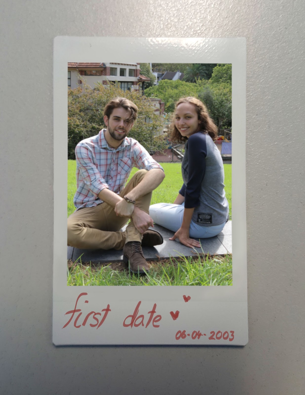
I like the third image as the text fits well, it's bold easily readable (I hope!)
If the group don't like any, I can always do more.


i like the third photo...thats all :)
ReplyDelete