Thursday 26 May 2016

NOPE

Ok, so I'm listening to a sad song from an anime called Angel Beats (don't watch it you will cry rivers). One of the characters are in a wheel chair and I had  A HORRIBLE BUT GRAND THOUGHT THAT IS TOO LATE.
Instead of Elizabeth sitting at a piano chair..she'd sit in a wheelchair D;

https://www.youtube.com/watch?v=tm7Xf9818FM&index=4&list=RDzIFV8UUs1-c


https://gargarstegosaurus.wordpress.com/2010/06/15/thoughts-on-angel-beats-1-11/


Wednesday 25 May 2016

Two ideas

I've been quite caught up this week with the formative game pitch presentations, but I did manage to start animating a shot on Monday.

The shot is of Elizabeth playing piano and turning towards her husband smiling and turning back to the piano.
I tried 2 different actions for this shot and showed my team mates. They liked the more exaggerated version, but our tutor recommended the more subtle movement as it suits the character better. I understood that, but wanted to show the character being more excited or happy to see her husband.

These are the ending shots for both versions that I tried. First one being the more exciting reaction and the second image being more subtle. I like the first one a lot, but I know that the second image suits the character and the feeling we want to show for the scene - being sad.
I will continue with the subtle version as it suits better :)


Saturday 21 May 2016

Animatic Feedback

Joseph updated the animatic this weekend. He put some background rendered shots of our environment to better tie in the scene as well as new footage. It's looking really good!
But there are a few picky things that I've pointed out. Sometimes it takes me a while to notice these things - I really should've looked at the animatic more as he's been working on it. I've been talking to him on FB about it and I'll share my points through this blog post.

Just small things include the audio 'No, not again!' wasn't synced to the video. Also adding the music in would be a good idea, as we now have our music. It wont need to be matched up perfectly, but as I said, we have the music. Might as well chuck it in.
Also playing with the lighting on the actor would be good, as it doesn't match up with the environment.

For the newspaper falling down, I recommended having like 2 shots of the newspaper falling (which can easily be done in photoshop) just to show the viewer that the newspaper is actually falling. Because at the moment it isn't showing that it's falling down or really even moved.

Regarding the shots, there are two shots that aren't quite right to me.
-In shot 2, the actor is running his fingers through his hair and this action doesn't seem in character to me. I mean if I was depressed about losing my partner, I couldn't care less about my hair.

-And shot 4, he's looking at the paper in his hands the whole time, not paying any attention to Elizabeth. Like why would he pay more attention to the paper than his deceased wife? He's pretty lucky to be able to see her when she's not physically there. Priorities man. So I suggested having him 'look at Elizabeth' until he sits down then he can glance at the papers then back to his wife. I mean putting myself in his shoes, I wouldn't pay any attention to work, food... anything! I'd focus on the wife. He was her world, it makes sense.

Reshooting these would be a good idea :)

(BTW Hamish, your doing a great job! I'm just nit picking),

Thursday 19 May 2016

Rough Animating

FINALLY, we've started rough animating. I started shot 6 where Elizabeth is playing the piano and she turns to her husband and turns back to the piano. It's really rough and is only construction. It looks... not nice, BUT our main focus at the moment is to get the movement across then go back to the hair and clothes. I'm not too sure about the second key/image, maybe it's because there's no face as it looks a bit creepy. The tilt might be a bit too much.
There are only 2 keys so far for this shot, but I don't think we really need anymore..


Wednesday 18 May 2016

Animation Planning

Taylor and I went over the animation plans. We only have 6 shots of animation which isn't much at all. We don't even have much action, but we will focus on the main movement of Elizabeth first, then go over the hair and clothes after. Some shots don't have much action, so we have made a system where we show the easy, medium and a bit more difficult shots to animate. This way the people in our team can say what shots they're most comfortable animating.
At the moment Taylor is drawing up some frames of Elizabeth's construction to work off as guide being side on and 3/4. This way the rough animators in our group wont go astray where she'd keep moving slightly around the screen. (Hopefully this DOES help!!)


Music

Unfortunately Holly cannot compose a score for us, as she is a very busy. BUT this is ok as we have found an alternative. Only Joseph and Gabby have heard it and they really like it. The others need to listen to it soon.

I like the constant flow of the first minute where there are no up or down parts to it. Although between around 1.25-2.30 there are some nice changes to the flow. These will work well with the 'up' parts of the scene (I hope this makes sense, I'm sure there's a word what I'm trying to explain...)

https://www.youtube.com/watch?v=0YRICEt7XiY

Thursday 12 May 2016

Coffee Table Re-Texture

My tutor suggested making the coffee table more grungy as the other furniture items are quite run down. I went over the textures in photoshop to make a more grunge like and it does look a lot better in terms of the rest of the furniture.


Prep for Animating

TAYLOR AND PHOENIX ANIMATION NOTES

SO we need to plan out our rough animation for our scene...

Elizabeth is pre much playing the piano as the husband is talking to her. Her arms are gently moving as she plays the piano
She turns her head slightly towards him and nods and smiles gently while still playing the piano. She turns her head back, concentrating on playing the piano while listening to her husband. Once the rumbling begins, she stops playing and turns towards him with a look of realization. She puts her left hand out to stop the husband while her right arm is resting on her lap. Puts both hands up to her heart and has a loving and reassuring smile. She puts her left hand out again towards her husband.

Her hair would move slowly as if under water. (Not at a consistent timed movement. We can afford to leave some inbetweens out as it would give as an almost random movement to the hair).
Very flowy and gentle. Any loose clothing would also move slightly. Obviously blinking from time to time.


References:
http://rebloggy.com/post/disney-submission-the-little-mermaid-ariel-disney-gif-reaction-gif-ariel-gif-the/78322512164
http://www.fanpop.com/clubs/the-little-mermaid/images/35279051/title/ariel-gifs-fanart

Wednesday 11 May 2016

Title & Credits Ideas

So like our group totally forgot about the title sequence and end credits D: Our producer, Joseph said that he'd do that credits and I had a pre neat idea.
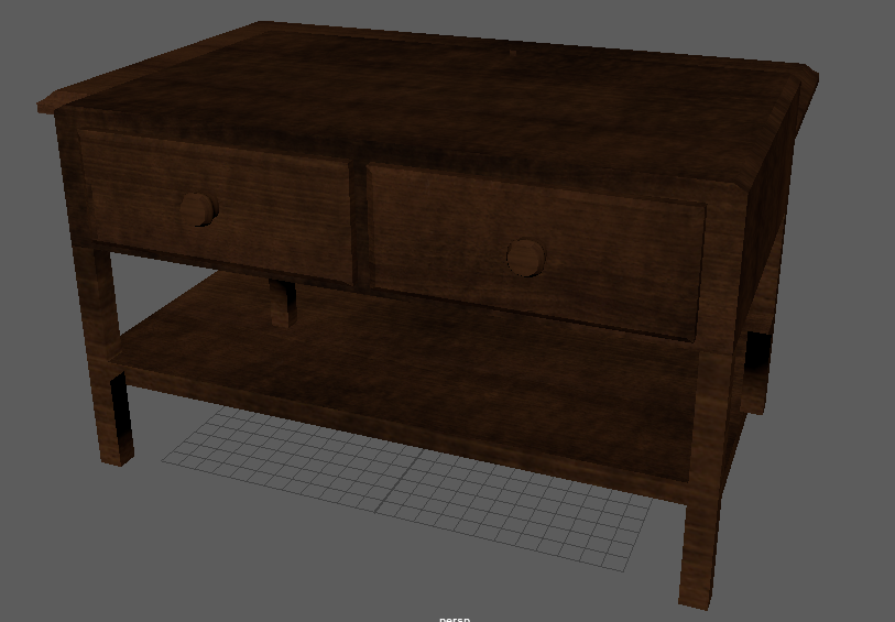
We can have a shot of the vanity unit to the left of the screen with the credits rolling up the wall next to the mirror. Our actor Hamish would be walking around the room (reflected in the mirror) , but it would be blurred as we don't want the focus on the contents of the mirror but on the credits. It would be quite boring if the credits were rolling on a still frame. Having the lighting change slightly throughout the credits rolling would be quite nice too. For example going from blue light to a pale orange. Even the credits slowly changing colour from blue to orange (might be a bit weird though as credits are generally one colour).

Our tutor suggested having the credits show up in a newspaper article which would be quite nice too. Rather than rolling they can flash (obviously softly).

BTW we have a gnarly as title for our story. Patrick came up with it. our story is called 'AFTERSHOCK' I really like this name as it refers to the aftershock of the earthquake, what and who it has effected as well as the aftershock of the male characters life - being without his wife.

Regarding the title card, we have a few ideas. I tend to find it quite neat when text is embedded into the scene rather than floating on the screen. One idea was to have the word AFTERSHOCK be carved into the corner of the vanity unit table. A truck would drive past causing the vanity unit to slightly shake, showing 'aftershock' physically.
Another idea that Patrick and I collaborated on is the word AFTERSHOCK to show in the shadows on the floor and it will disappear when the door is closed when the husband arrives. With this idea the door could slam shut causing the apartment to shake slightly and the word AFTERSHOCK will be shaken also and disappear slowly after. I'm not sure if the title for this idea would be shown as darker than the shadow or lighter as a sort of light source. I will try both ideas anyway.
Taylor suggested having a newspaper article having the title of AFTERSHOCK also which would be nice in comparison to the newspaper clipping in the scene.

IDEA FOR ENDING CREDITS (come back to near end ish of term)
In terms of a light source during the rolling credits, having a soft candle light flickering on the wall would be super nice.
In the mirror we would show our actor (blurry) walk out of screen and we would hear him light a match. Then a soft candle light would come on, flickering on the wall as the credits roll.
Obviously the light from the match would also shine on the wall, so it could shine on the wall when the title AFTERSHOCK appears as it would be a brighter and a harsher light. Then when the candle is lit, the credits continue.

Bookshelf Changed to blue books

My tutor suggested to change the books to one shade as it was too colourful beforehand. So I changed the books to a range of blues and purples. I reckon it looks a lot better and not super busy. It will also suit the mood and main colour theme, being blue, of the apartment and emotion for the story.


Sunday 8 May 2016

Vanity Unit Props

I put simple lamberts on the vanity unit objects as they aren't as important as the vanity unit itself. They aren't important props, but they add detail and depth to the scene.
I'm not sure what to do with the magazine stack yet...pretty tempted to chuck a G Dragon magazine cover photo just for Keat HAHA but yeah, might not be suitable, we'll see.

Coffee Table textured

Coffee Table texturing complete! Yay!
I used the same texture as the shelves in the bookshelf, but I darkened the colour by recommendation by Taylor. It turned out really nice and was easy to texture :)


Wednesday 4 May 2016

Image Planes done

Quickly put together the framed sunset and images of the polaroid photo and newspaper clipping into maya. Tomorrow morning before the meeting, we're hoping to have the scene set up (even if it's not complete) just so we as the group as well as the tutors can see how it will look close to finished. Patrick will be putting everything together in the scene, while Taylor and I carry on working with the objects in the scene. The bookshelf and vanity unit are almost complete. I will start texturing the coffee table once that is ready which will hopefully be done tomorrow.

I took the photo at Muriwai beach in the holidays and showed the group and got thumbs up all round. The sizing of each image isn't quite right, but that will be sorted out later on :)


Textured Bookshelf

Here's a rendered picture of the textured bookshelf. I'll hand it over to Taylor and she will be doing the glass texture.
I haven't had time to work on it at home, but I got faster applying the textures as I worked on it today, so other objects shouldn't take too long. We're really only applying textures on a few things being the bookshelf, coffee table and the couch. Everything else will have a simple lambert on it.

I don't really know why I used complimentary colours on the books that are on the floor. PERHAPS it represents the husband and wife and how they're in opposite worlds~ or because skittles.

Sunday 1 May 2016

Term 2

I haven't posted anything in the last 2 weeks because..I didn't really do anything. I tried texturing at one point, but I couldn't figure out why the texture was coming up so blurry in photoshop, so I decided to wait until course started back up.

I've started texturing the bookshelf and it's looking pretty good. The texture does stretch a bit at the detailed parts, but we wont be seeing this in the final output of the scene.

Would be ideal to have everything textured and the room set up by next week!!